I'm Amanda and I’m passionate about creating a well loved and well lived in home for my family and I Iove to help others do the same!
learn more...
Welcome!
Shop
Shop
Shop
HOME
style
brands
let's connect
get on the list
never miss out.
get exclusive tips, news & free resources!
Enroll Now!
shop ART
Sometimes new build homes can be a bit lacking in “character” in certain areas. Some of the most neglected spaces are the entryways, mudrooms and walk-through pantries that are so common in modern suburban design! This home entryway makeover added character, function and of course a little bit of pretty to a builder basic space!
Estimated reading time: 22 minutes
Note: This post may contain affiliate links that won’t change your price but may share some commission.
Table of Contents
Why an Entryway Makeover
Our friends had a classic example of lack of function in their lovely, lake community home in Edmonton, AB. And the weather here kinda demands that we have functioning entryways. With all the boots, snowsuits, and endless seasonal clothing, we need storage and lots of it!
The homeowners have 3 kids, the cutest pup, and a busy schedule and they really needed a space that worked for their family. We renovated their joined mudroom/laundry room and pantry spaces and it’s quite a spectacular before and after if I do say so myself!
You can see a cost breakdown of the entire renovation at the end of this post.
The Pantry Before
Here’s a view of the pantry space “before” viewed from the kitchen. Standard wire shelving fills the space, but actually leaves very little room for items. The shelves cut storage capacity in at least half as they aren’t making use of the full depth of the available space.
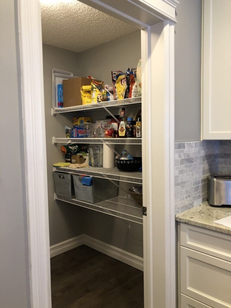
Everything is on display, and there are no defined zones for like items, which makes it very difficult to find what you are looking for. The paint is a dark colour, which makes the windowless space seem even darker than it actually is. And it has one of my pet peeves…textured ceilings lol!

You walk through the pantry to get to the mudroom area, which is also the laundry room. There was a door between the spaces, which makes for an awkward transition. The two doors almost touch when they are both open and completely cover the wall. This is a waste of wall space that would be perfect for a family organization center or chalkboard for grocery lists.

The Mudroom & Laundry Room Before
The door at the back leads to the garage and is the main entrance to the house. (The front door is mostly used for guests and the family comes in through the mudroom space). There was an attempt to add function with some shoe cabinets on the wall and a coat rack unit by the door. But it felt cramped, even though there wasn’t actually much storage added.
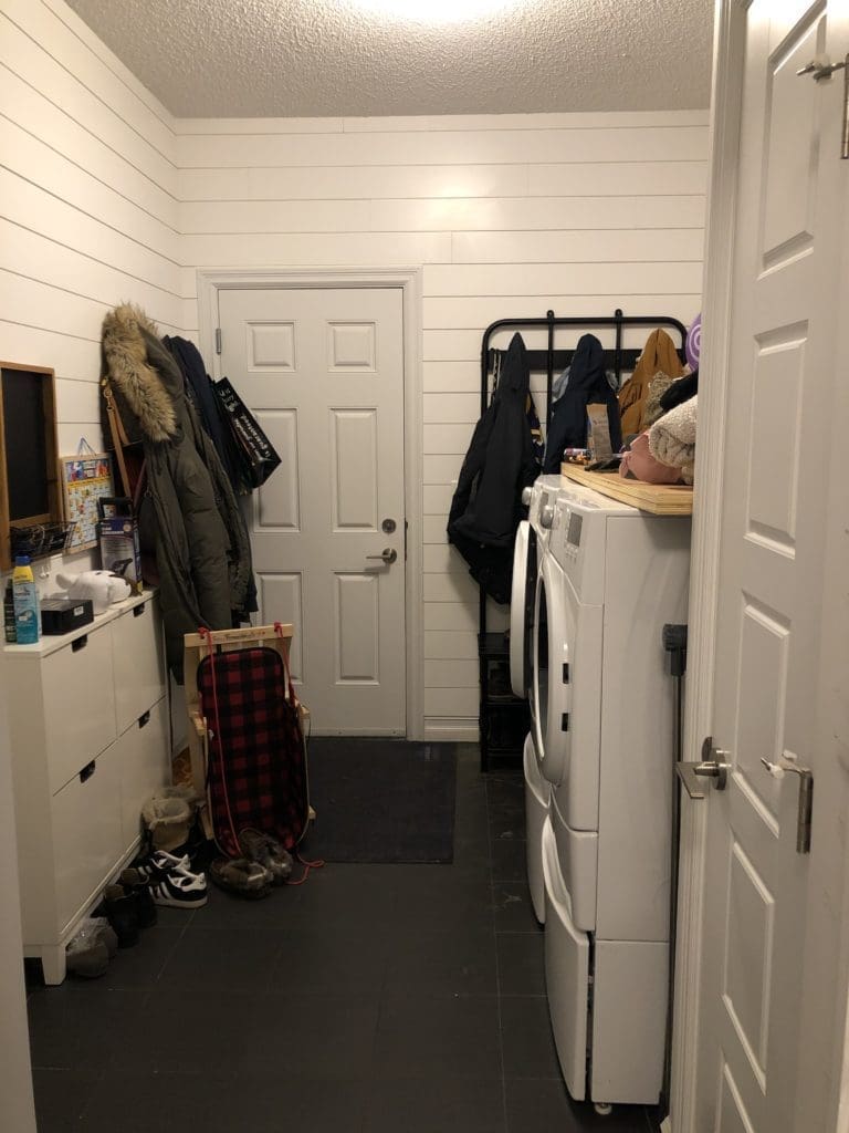
The space on the larger side of the room isn’t being utilized well. This is a nice tall room, and all that vertical space is crying out to be used! Because that space isn’t optimized, there’s too much stuff being stored on the wall behind the door, making it hard to open.
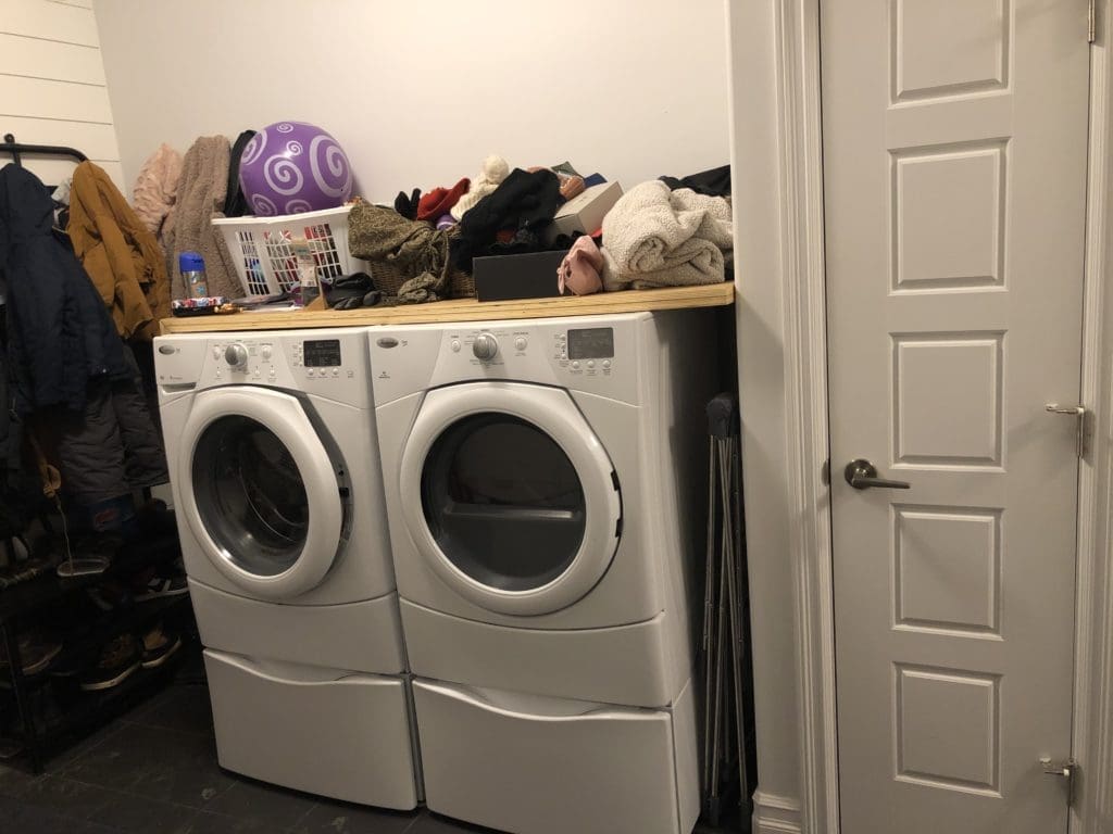
A few more common mistakes on this side of the room as well…
There’s a tiny closet, which seems like it should add more storage, but is just wasted space. There is no organizational capacity inside, the height above the door is unusable and the wall just takes up more precious real estate in this small area. It seems counter-intuitive, but taking small closets like these out is usually a good idea.
The homeowners had placed their washer and dryer on the matching pedestal drawer units. In my experience, these usually end up being wastelands of forgotten socks and dryer lint and they make the units too tall to have usable counter space above.
This entryway makeover did turn into a little more than we expected. This was our first project outside of our own home and we really wanted to do it right. Also, COVID19 hit right in the middle of the build, so there were some pretty major delays and obstacles. But we finally finished and it was worth the wait.
Spoiler alert…here’s a peek at what it looked like when we were all done!
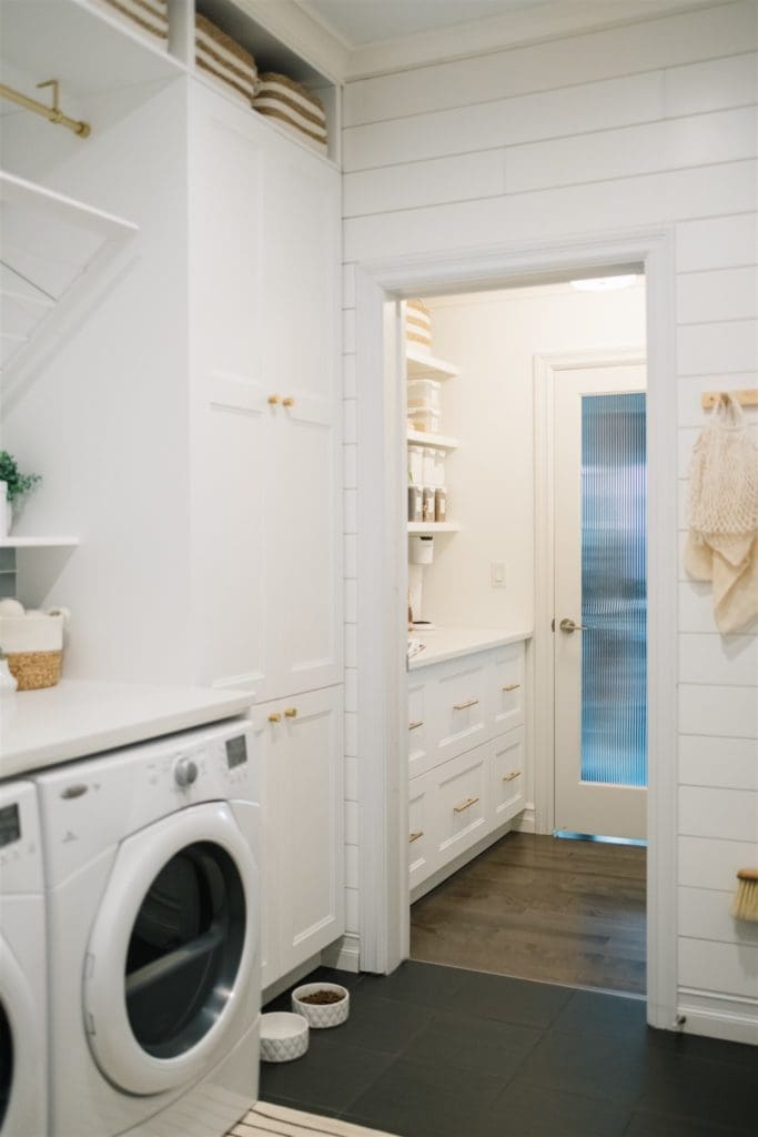
Pretty shocking right? And we did it all on a reasonable budget, which we will share below!
The Design Plan
When I was designing this entryway makeover, I tried to say true to the bones of the house as well as the location etc… It’s fun to try the newest design trend or go crazy with DIYs, but this home is a long-term investment for the owners and I wanted to make sure I kept that front of mind during the process.
We also sat down and decided exactly what needs were to be met in this space. And we didn’t forget anyone, even the furriest member of the family.
TIP: When you are redesigning a space, this is the easiest place to start…make a list of what you need i.e. storage for dog food, a place for winter coats off-season, storage for cleaning supplies etc… and then create zones based on those needs.
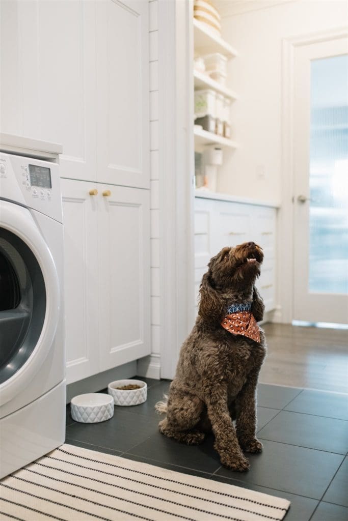
The house is in a lake community and has a lot of blue and grey throughout, so I kept a neutral palette of whites, creams and sand colours but added some pretty watery blue tile for a pop of colour. The gold hardware keeps the space warm and modern feeling.
We kept the existing interior and exterior doors, door hardware and flooring to keep the budget from escalating. All of these elements were neutral enough to be worked with. The doors and hardware can be updated, painted, or changed at a later date. We wanted to focus our energy and resources on what mattered most.
The Walk Through Pantry Makeover
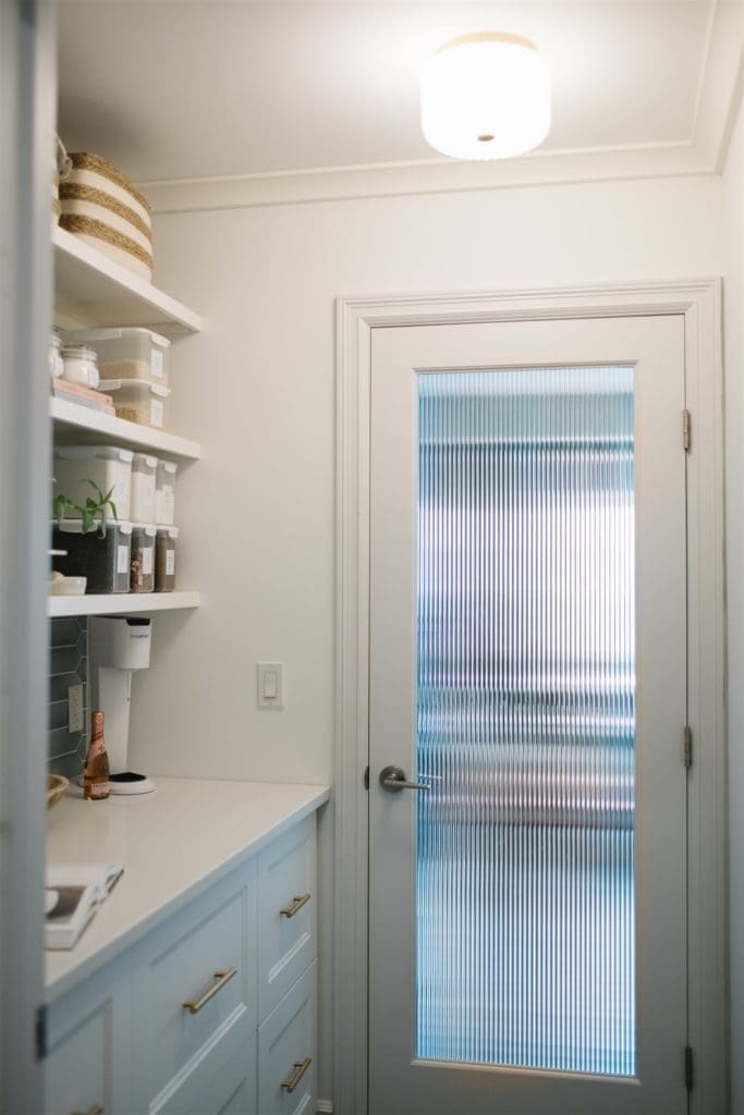
I wanted the pantry to be functional, but also beautiful as it is part of a major traffic route, is used often, and is visible from multiple areas in the house.

Cabinets & Countertop
We added base cabinets in the pantry space to add more storage. These are the AXSTAD line of cabinets from Ikea. The house has a large kitchen so all of the small appliances etc.. already had a home. The need in this space was storage for lots of recycling, pantry staples and snacks. By adding 24″ deep base cabinets we doubled the amount of storage that was provided by the underwhelming original wire shelves and also added much-needed counter space. Now when you come in carrying bags of groceries there is somewhere to put them down!
The drawers have designated zones for paper, glass and plastic recycling, snacks etc… We kept the snacks low on purpose so that the kids could help themselves.
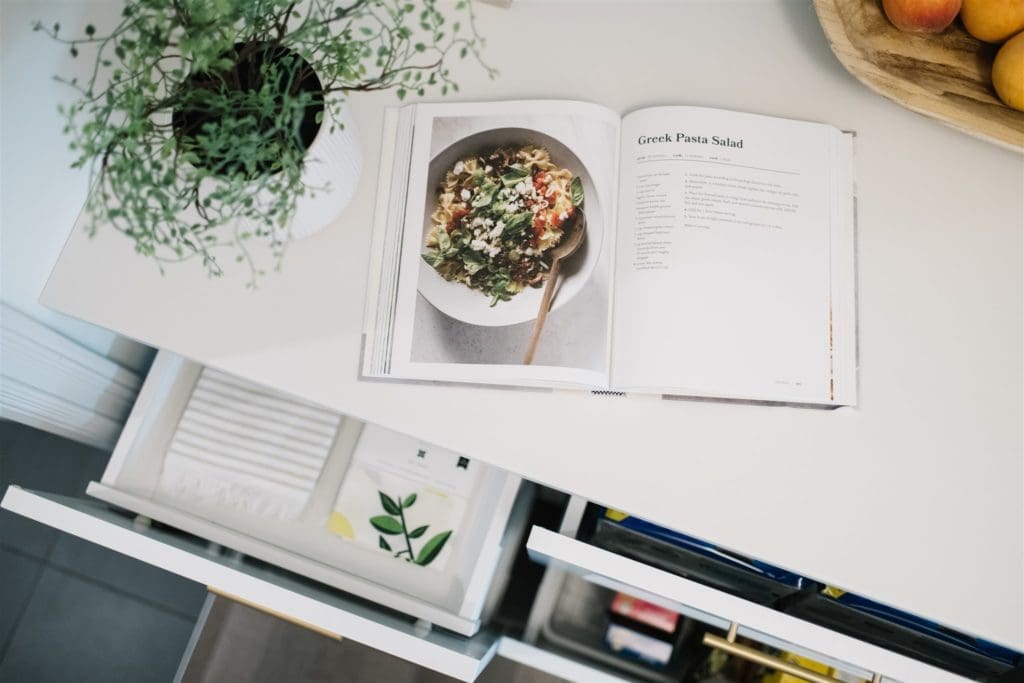
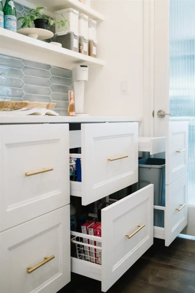
TIP: Even though the cabinet interiors all have different configurations, we kept the same double fronts on each one to create a pleasing and symmetrical look when they are all closed!
Open Shelving
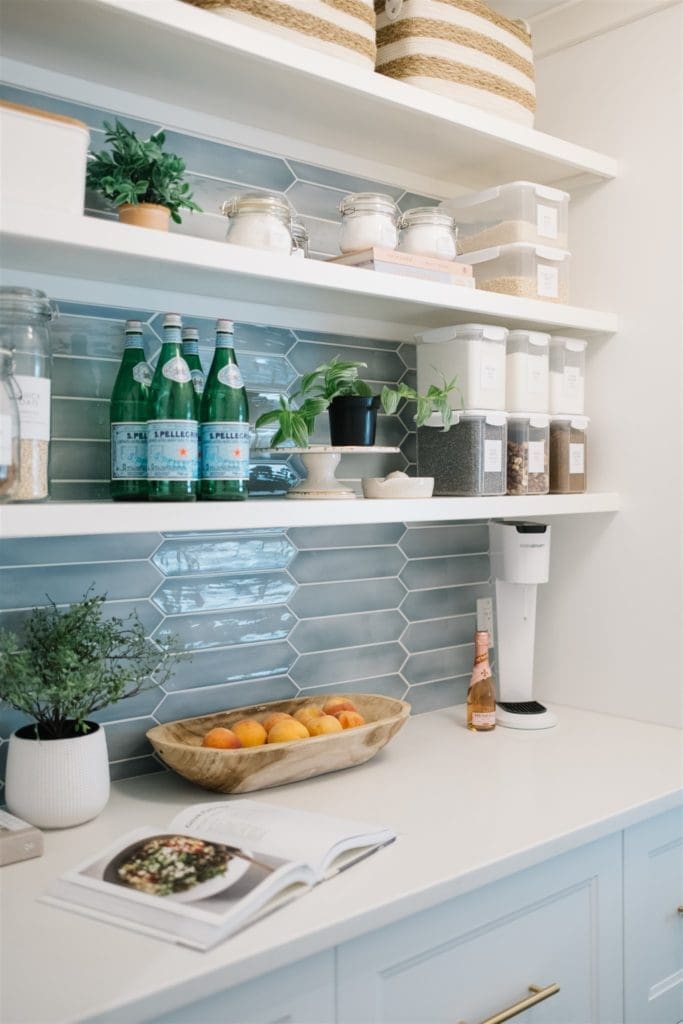
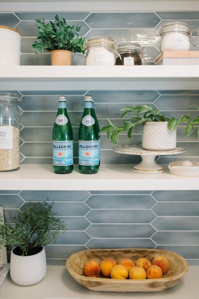
Above the cabinets, we installed simple open shelving and decanted staples into clear containers with custom labels. Decanting may seem like a lot of extra work, but it’s actually quite simple once you get in the habit. You can see clearly what you have and what’s running low and you can avoid overbuying!
Full disclosure: I styled this space for photos and there are usually MORE containers than this on the shelves lol!!
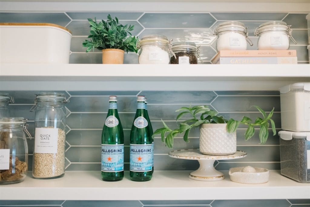
We added some closed storage to the shelves as well, like the cute baskets on the top shelf. These allow you to still store the things that can’t be decanted into pretty containers without staring at mismatched packaging.

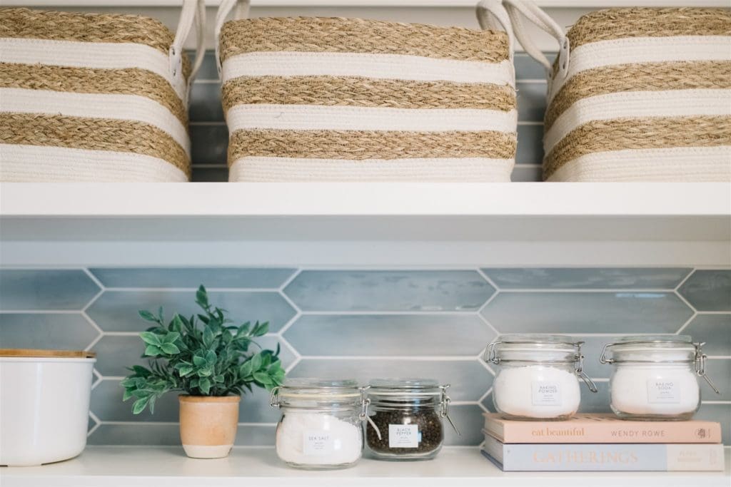
Mixing in a few favourite cookbooks and some potted plants (faux in this case) makes running in to grab a few things for dinner feel more like an experience than a chore. I’m all about elevating the ordinary!
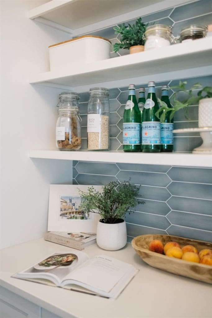
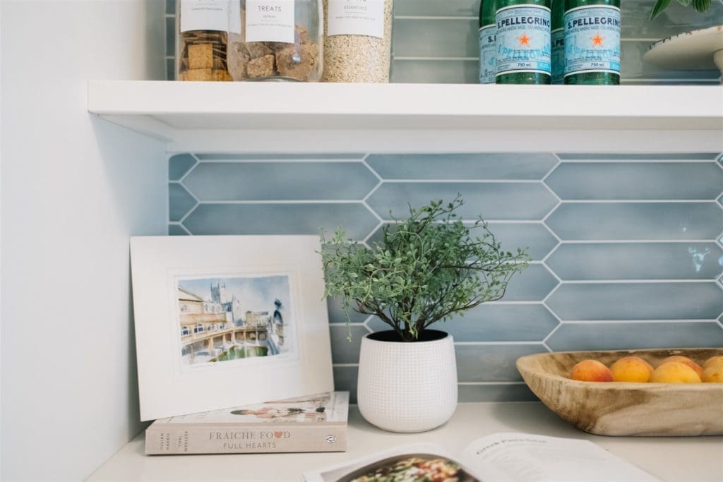
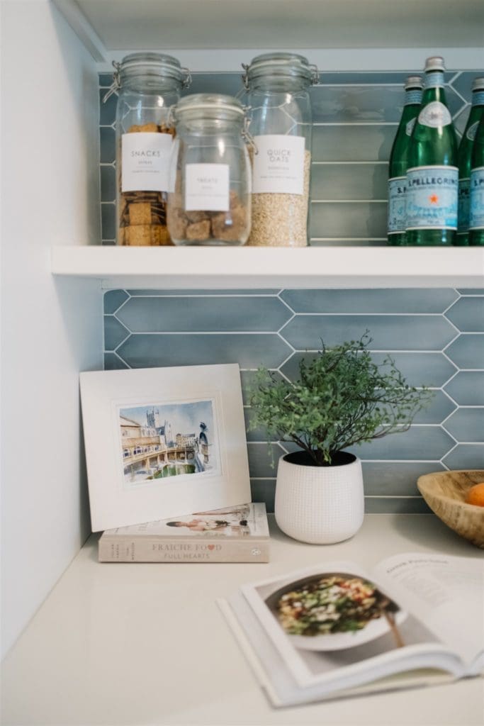
Because we created so much extra storage space, there’s no need to clutter the counter with packages. We created a little vignette with a vintage dough bowl to store fruit, more greenery and a sweet little art print.
TIP: Enjoying your space aesthetically is ok. You can put unexpected things in your home wherever you like, just because you love them! It’s YOUR home!

The Tile
I’ve been asked about the tile A LOT, so here are some details! This tile was an affordable option at about $12/sq ft ( CAD dollars). Custom, hand-painted tile seemed to be about $50/sq ft, which was not within budget. These tiles look hand-painted and are a fraction of the cost. Total score!
TIP: We ran the tile up the entire wall behind the open shelving. This gave the space a luxe, more designer look for a relatively small price tag!
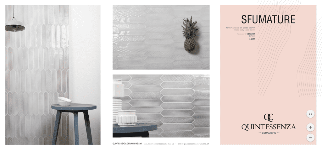
The tile is SFUMATURE by Julian Tile. We found it at BFC in Edmonton, AB. But if you aren’t local you should be able to find it from a supplier in your area. It comes in lots of pretty textures and colours including white and pale pink! Not gonna lie, we were really tempted by the pink!!
Lighting
The last thing to note is that this space gets zero natural light. Both the pantry and the mudroom have no windows. So in the pantry, we added a semi-flush light fixture with 2 bulbs to make sure that it was well lit…Something to think about when you are hunting for light fixtures as many of the smaller ones only have a single bulb.
The Mudroom & Laundry Room Makeover
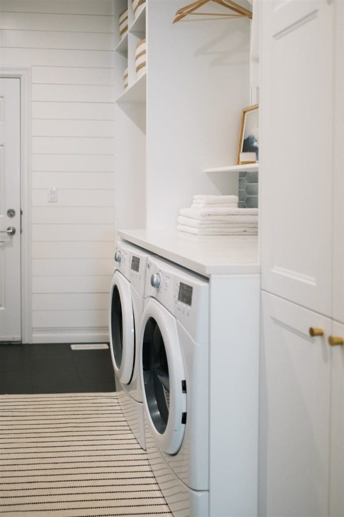
Can you believe this is the same space?!
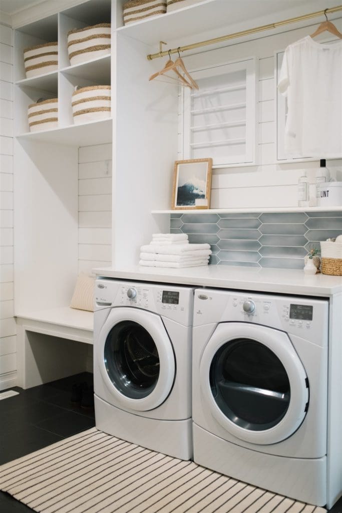


We created our own built in wall of storage using the same AXSTAD Ikea cabinetry that we used in the pantry. By adding crown moulding at the top we made the cabinetry units look fully built-in.
TIP: When we are creating “custom built-ins” using Ikea cabinetry, we always use the prefinished cover panels to create the custom-built parts. The panels are factory finished so they perfectly match the cabinets and you don’t have to struggle to match the paint color or the smooth finish (which is nearly impossible to do).
Challenges
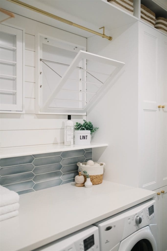
We took the washer and dryer off their pedestals so that we could build the cabinetry around them and install countertop above to create a drop zone and laundry folding station.
It’s hard to tell, but there is actually a strange 6″ half-height wall behind the units. Because the wall behind is an exterior wall, the builder just created a faux wall inside the room to house the plumbing and electrical so that it doesn’t all freeze. It was quite the eyesore. We had to move the plumbing slightly and cut a few inches off this annoying wall to make all the cabinetry fit. (You can see the struggle on my Instagram highlights lol!) We then tiled the mini wall and capped it with a shelf to disguise it and also to add some extra storage for things you would reach for often like laundry detergent etc… Mission accomplished! You can barely tell it exists!

The cabinetry on the right of the photo above is where that tiny little drywall closet used to be. Remember that? Scroll back up to see it if you don’t remember!
Functional Zones
Creating zones is important in a multifunctional and heavily used space like this one. We created 4 main zones, each with a purpose and intended to make daily chores and rituals much more manageable.
The Household Zone
By taking out the oddly small cupboard in the corner of the room we were able to install full height cabinetry to house everyday household items such as paper towels, dog food, cleaning supplies, etc… By replacing the cupboard space with a full 90″ tall x 24″ deep storage cabinet, we were able to fit so much more in and make use of every inch of vertical space! We simply left the shelving out of one section of the cabinet to make sure there was still a space for the taller items like brooms, mops etc..

The Laundry Zone
One of the big challenges in this space was to create a zone for laundry that was functional, but that was out of the way, since the room is the major traffic route in and out of the house. The last thing you want is to be tripping over piles of clothing trying to get the kids off to school in the morning, or getting clean laundry mixed with dirty boots!
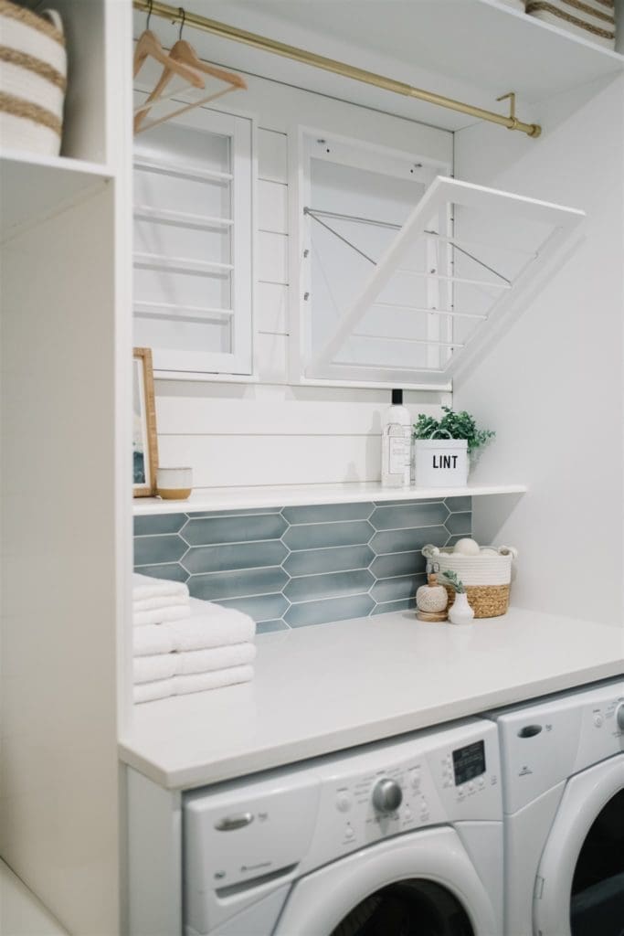
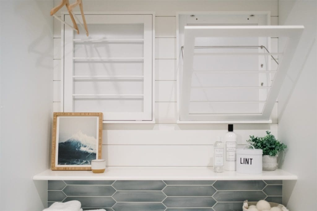
We found wall-mounted drying racks that can be closed up flush to the wall or opened out over the countertop to hang clothes to dry. We also mounted a brass curtain rod to the top of the cabinet to add the option of hanging clothing like dress shirts etc…that need to be ironed or steamed. You can reconfigure the area to dry items without anything protruding into the room.
The Seating & Storage Zone
To the left of the laundry area, we created a storage and seating section close to the door. There is a built-in bench where you can sit to put shoes or boots on. I think this is a must in any entryway design. Whether it’s for the youngest member of your family or the oldest, someone always appreciates being able to sit down!

There are some hooks above the bench and then above there are some large baskets to store hats, mitts etc… When everything has a place it’s so much less stressful trying to get the family out the door!

The Hanging Zone
On the other side of the room, we removed the shoe racks and general clutter and opted for simple rows of white metal hooks. We felt this was the best use for a very shallow space. The main traffic path through the area remains clear.

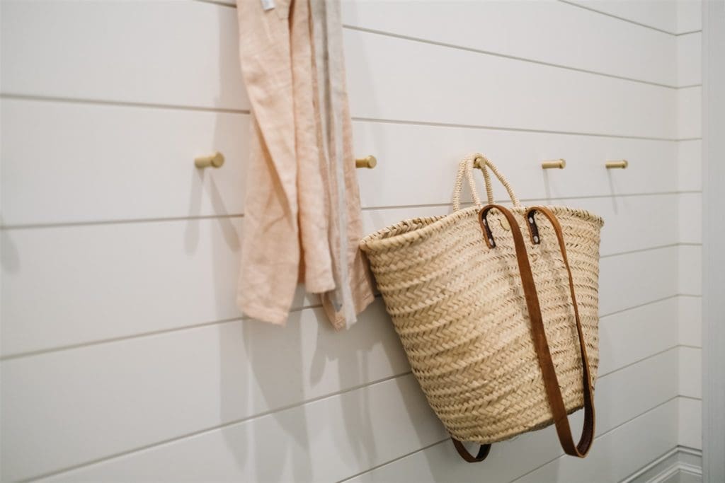
A row of hooks higher up allows plenty of hanging space for adults’ jackets, bags etc… and a smaller row of brass peg hooks below allows kids to hang their belongings in their own special spot. This allows them to tidy up after themselves and also makes use of the entire wall space.
The Extra Zone
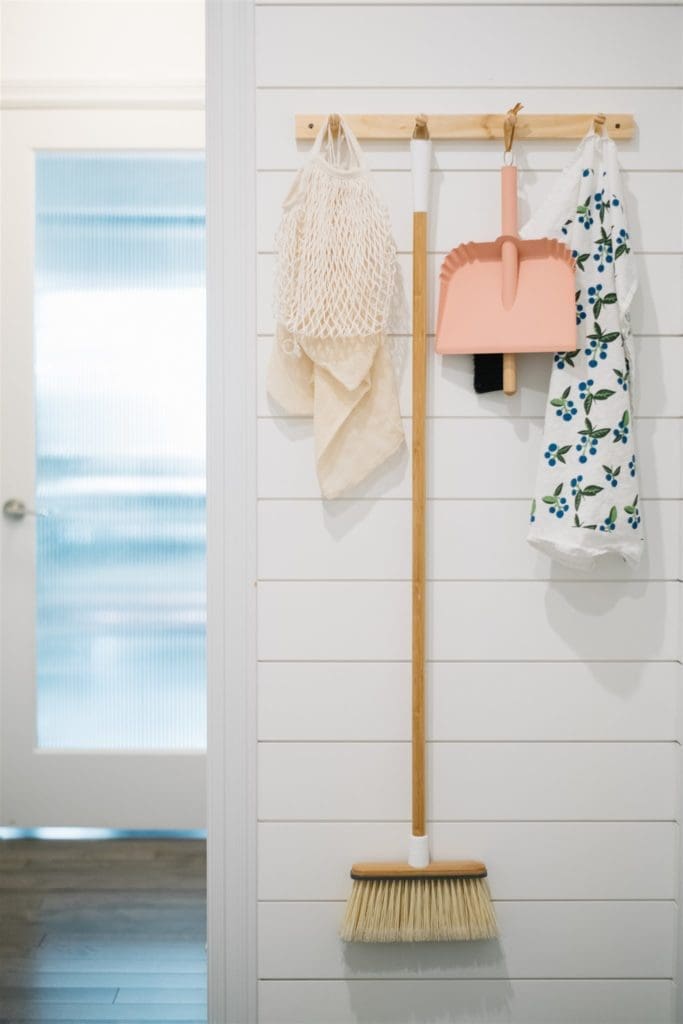
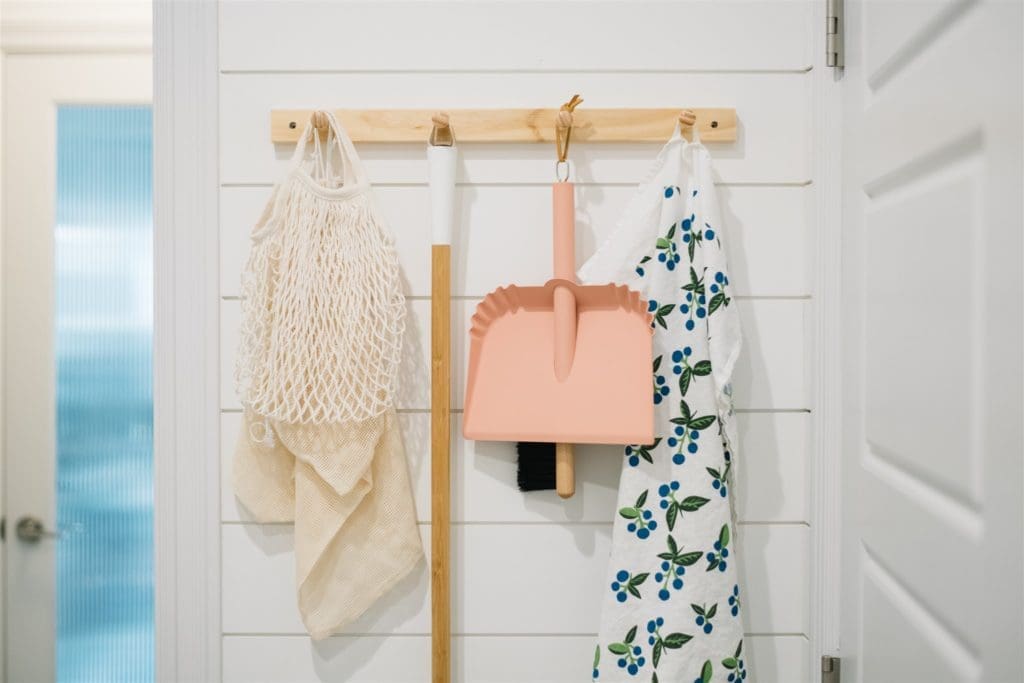
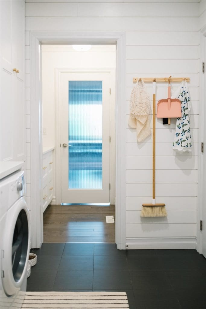
You want to make sure you are using every square inch in a small, multifunctional space like this one! Beside the door to the pantry, we installed a cute little wooden peg rail for commonly used cleaning supplies like the broom and dustpan. The items look pretty, but are also easy to grab. (The pink dustpan was from West Elm, but it’s sold out and I haven’t found anything else quite like it! The tea towel is from Ten & Co.)
We ended up simply removing the door between the mudroom and pantry. This allowed the spaces to flow together and feel larger. We considered taking out the hardwood in the pantry and matching it to the existing tile in the mudroom. But in the end, time and budget won out and we left it as is!
This brings me to perhaps the most interesting part of this post… How much did all of this cost? We tried to do this project on a reasonable budget, but still create a designer look. We saved money by doing all the labour ourselves and working with the existing structure as much as we could.
The homeowner had already installed shiplap in part of the mudroom, so we finished the entire room in the same. The floor tile was neutral and in perfect condition, so we kept it. There was existing electrical, plumbing etc.. in place so we kept the room layout similar enough that none of these things needed to be moved.
So without further ado, here’s the breakdown:
The Entryway Makeover Cost
So I’m going to share the cost of this makeover with you, because I think it’s always helpful to see when you are thinking of doing something similar in your home.
However, keep in mind that the cost of materials, labour etc… varies WILDLY by location and it may cost you much more or much less! We had no labour costs in this breakdown as this was a DIY project for us. Labour is usually the most expensive part of the job (at least it is here). Supplies are extremely expensive where we live and it costs us a small fortune to ship things from the US, so things like the baskets would cost you much less if you are American.
This budget is all in Canadian dollars (so American readers lower the cost by about 30%).
The Pantry
- Paint – $100
- Lighting – $210
- Ikea Cabinetry – $1000
- Containers & Baskets – $300
- Countertop – $550
- Décor – $45
- Hardware – $95
- Miscellaneous – $50
- Tile Saw Rental – $90
TOTAL $2440 CAD
The Mudroom/Laundry Room
- Tile Saw Rental – $90
- Shiplap – $200
- Paint – $160
- Lighting –
- White Hooks – $72
- Brass Hoooks – $55
- Ikea Cabinetry – $1500
- Baskets – $230
- Brass Rod – $75
- Clothing Drying Racks – $235
- Countertop – $550
- Décor – $100
- Custom Pillow – $169
- Peg Rail- $22
- Pretty Cleaning supplies – $50
- Miscellaneous – $72
- Hardware – $100
TOTAL $3680 CAD
Note: Some of these costs could have been lowered further. We could have bought less expensive baskets, light fixtures and décor accessories, but the homeowner was happy to splurge on a few items like this since we were saving so much elsewhere. These slightly more expensive options are what give the room a more designer look, but you could find options that look similar, but cost less.
We installed a stone counter, but you could save $$ by installing a laminate or wooden counter. Ikea has some really nice options. We just used their “Ash” countertops in our homework nook space in our own home, and at $75 for the entire slab, you can’t go wrong!
Entryway Makeover Real-Life Update
Whenever you see beautiful renovations online with minimally styled photos you always think (or at least I do)…but where’s all the stuff? When I take pictures of my own home it’s usually in a giant pile just outside the camera frame lol!
The homeowner took a few quick snaps the day I was writing this blog post to show me the current state of her space! As winter arrives, I’m sure there will be a few more boots and coats in the space, but here’s what it looks like now…
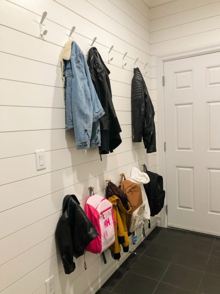
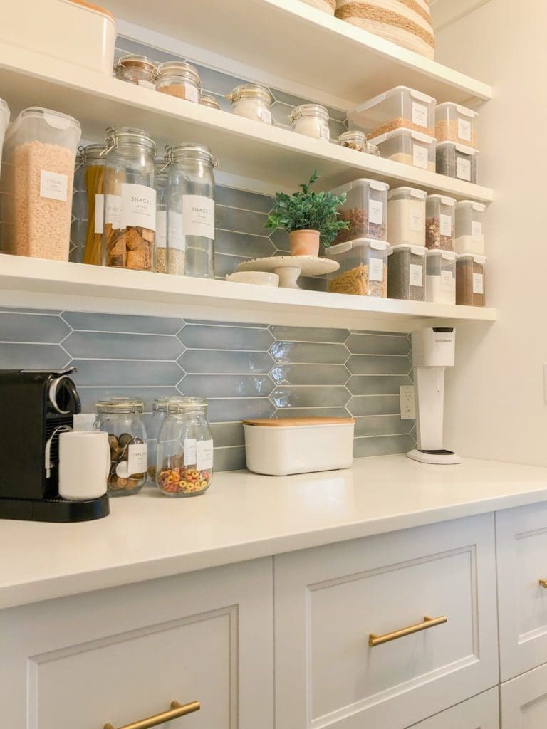
Everything still looks quite minimal and spacious. Even if you weren’t quite this minimal yourself, you could fit a lot more stuff in these spaces without it feeling cluttered. The key is to have a place for everything and to edit everything so there is a place for it.
I hope you’ve enjoyed this builder-grade home entryway makeover!
Leave a Reply Cancel reply
This site uses Akismet to reduce spam. Learn how your comment data is processed.

where is the link to the ikea cabinets pls?
Where is your brass rod and the hooks you used for it from? I’m trying to find the links but cant
I think it was from Cb2
What cabinets did you use for the “built-in” ?
Where do they put their shoes/boots? U did a fabulous job..looks amazing…
Hi and thank you! In the half wall behind the little curtains there are baskets and also shoe/boot storage on the bottom!
Awesome job. It looks great.
Could you post a layout of these rooms?
It looks stunning and so practical too. I am also loving the color scheme – so ME! Had a question, where did you get the glass door for your pantry?
It adds so much to the look as well. Thanks for sharing your awesome low-budget make-over. 🙂
Hi! I love all the areas you remodeled! We are doing some similar style options in our kitchen. The tile you used in the pantry ( blue color that you got from SFUMature), I was able to find it but wanted to check. Is the color Azzurro Gloss? Thank you!
I believe so, yes.
Which exact tile (color and texture) did you use for your backsplash? I LOVE it and don’t want to select the wrong shade online. Thank you!